AI Logo Prompts | Mark Type, Scalability, and the Clean Edge
A logo is the most constrained visual design problem there is. It must communicate a brand's identity in a single mark. It must be legible at 16 pixels as a browser favicon and at 3000 pixels on a billboard. It must work in full color, single color, and reversed on a dark background. It must be simple enough to be instantly recognizable and distinctive enough not be confused with anything else. Standard AI art prompts, built for illustrations, portraits, and scenes, violate every one of these constraints. They produce complex, textured, multi-tonal images that look impressive at screen size but collapse into unreadable noise when scaled down to an app icon.
These prompts are structured around the functional requirements that separate a working logo from a pretty image: mark type (what kind of logo it is), rendering format (flat vector, not photographic), color system (limited, named, reproducible), negative space usage (the shape defined by what's absent, not just what's present), and scalability (does it survive reduction to its smallest intended use).
Every prompt has been tested in Kalon Studio with outputs evaluated at full resolution and then reduced to 64px and 32px to verify that the mark remains identifiable at functional sizes.
Prompt Text
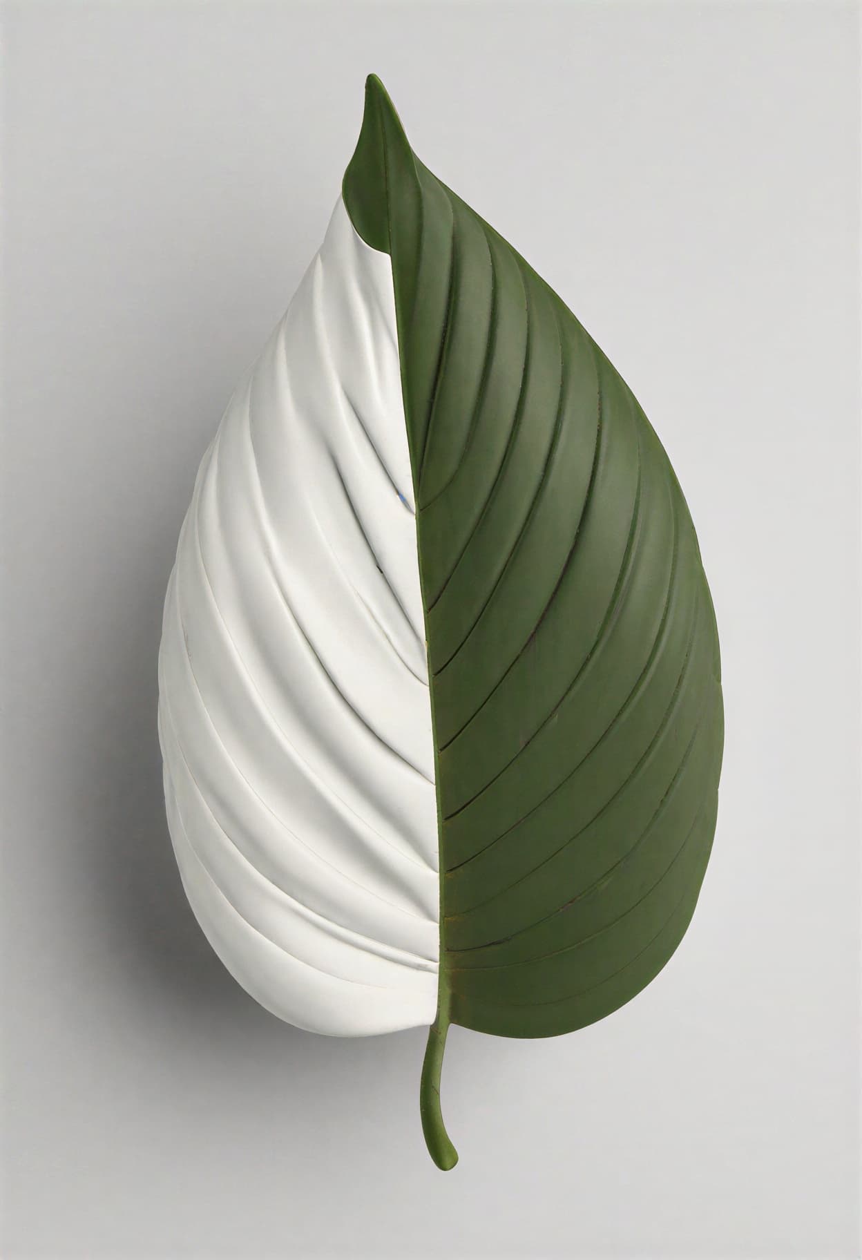
This prompt generates a clean, flat vector-style logo mark with controlled complexity, limited color, and scalable composition. Replace the brand concept and icon description with your specific identity elements.
logo design, flat vector illustration style, single iconic mark, abstract leaf shape formed from two overlapping geometric curves, clean precise edges with no texture or grain, solid flat color fills with no gradients, limited palette of forest green and white on transparent background, balanced symmetrical composition, generous negative space around mark, scalable from favicon to billboard, no photographic elements, no realistic textures, no text, professional brand identity quality, high resolution
What Logos Demands from AI Prompts?
AI image generators are built to produce rich, detailed, complex images. Logos require the opposite — radical simplification. Every element that makes a standard AI image impressive (fine texture, atmospheric depth, photographic realism, tonal complexity) makes a logo worse. The prompt structure for logos must actively constrain the model's instinct to add detail, pushing it toward the geometric precision, flat rendering, and compositional economy that functional brand marks require.
Sample Outputs
All images generated on Kalon Studio using prompts from this page. No external vectorization, color correction, or post-processing applied.
What You Can Create?
Logo prompts serve different stages of the brand identity process — from early concept exploration to presentation-ready marks. These are the most common applications.
Brand Identity Concepts
Rapid logo concept generation for brand identity exploration. Use 1:1 for mark-only compositions. Generate 10–20 variations of the same brand concept, each with different mark types, color combinations, and compositional approaches, to build a selection deck. The base prompt and minimalist variation produce the cleanest starting points for iteration.
App Icons and Favicons
Simplified marks designed to function at the smallest display sizes. Use 1:1 square format. Icons need the highest level of simplicity — one shape, two colors maximum, no fine detail that disappears at 64px or below. The tech abstract and minimalist variations handle this format best.
Social Media Branding
Profile images, channel icons, and watermarks for social platforms. Use 1:1 for profile images. The mark needs to read clearly inside a circular crop (most platforms display profiles as circles), so centered, compact compositions work strongest.
Merchandise and Print Applications
Logos intended for t-shirts, packaging, signage, and physical media. Use the aspect ratio that matches the print layout. Emblem and badge variations work well for merchandise because their self-contained composition adapts to placement on varied surfaces. Single-color or two-color logos reproduce most reliably across physical media.
Prompt Variations
Five fundamental logo types, each with a structurally different prompt approach. Copy any directly, or use the mark-type structure as a framework for your own brand concept.
Clean Minimalist Mark
Maximum simplicity. One shape, one meaning.
logo design, ultra-minimalist flat vector, single geometric mark, circle with a precise triangular notch cut from the upper right quadrant suggesting forward motion, solid black on white background, no gradients no texture no shadow, mathematically precise curves and straight edges, maximum negative space, designed for extreme reduction to 16px favicon, one color only, clean, modern, professional, high resolution
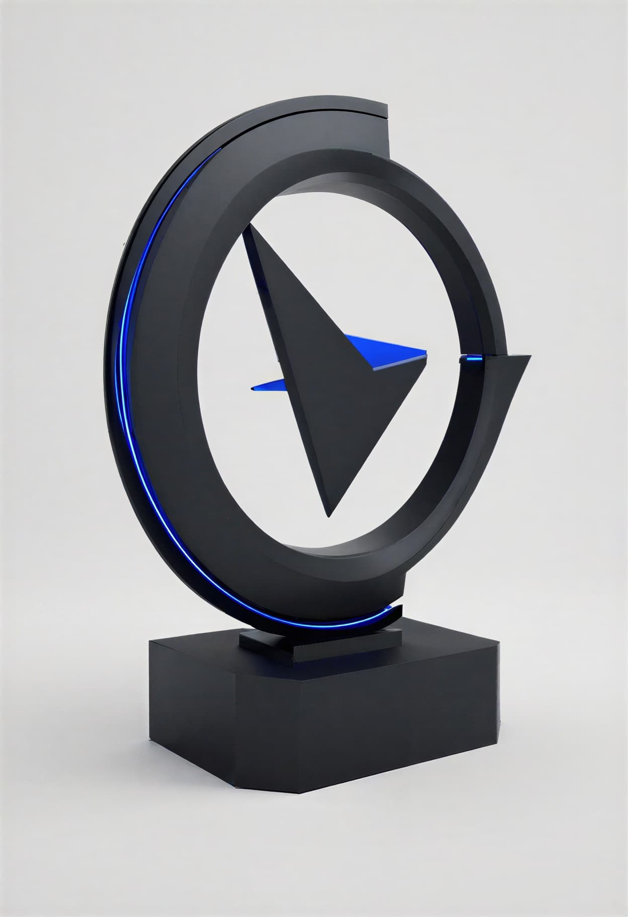
Tech Startup Abstract
Angular geometry suggests innovation and velocity.
logo design, modern tech logo, flat vector style, abstract mark composed of three interlocking angular shapes forming a forward-pointing arrow structure, sharp precise edges, electric blue (#0066FF) and dark charcoal (#1A1A2E) two-color palette, no gradients, geometric precision, contemporary sans-serif feeling without actual text, balanced asymmetric composition, clean white background, startup and SaaS aesthetic, scalable and icon-ready, high resolution
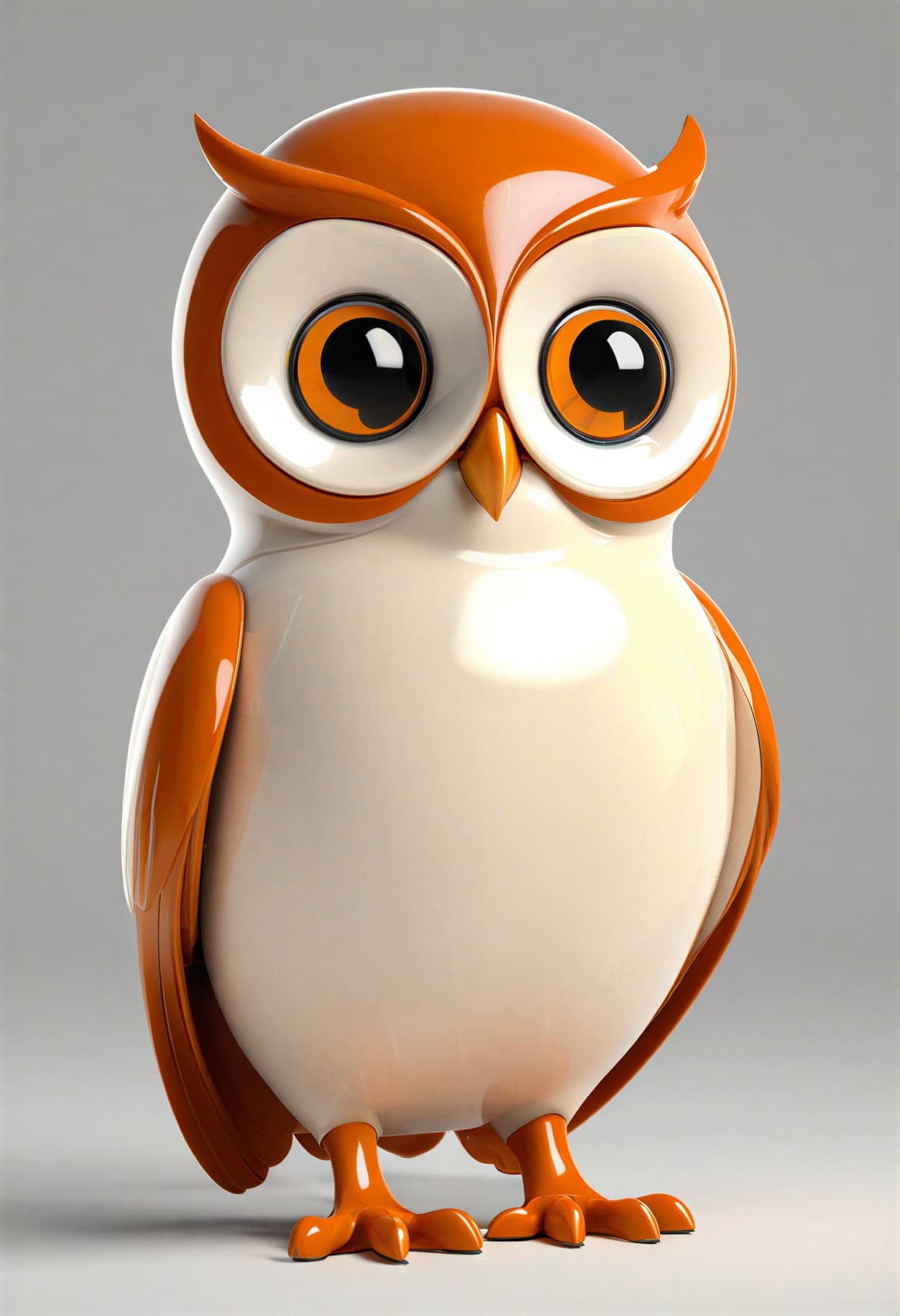
Mascot Character
Friendly illustrated figure as brand ambassador.
logo design, mascot logo, flat vector illustration, friendly owl character with large round eyes and slight head tilt, simplified geometric body shape, wings folded, standing on branch element, warm orange and cream two-tone palette, bold clean outlines with uniform weight, no texture or grain, approachable and trustworthy personality, compact composition fitting within circle boundary, suitable for both children and adult audiences, mascot brand identity quality, high resolution
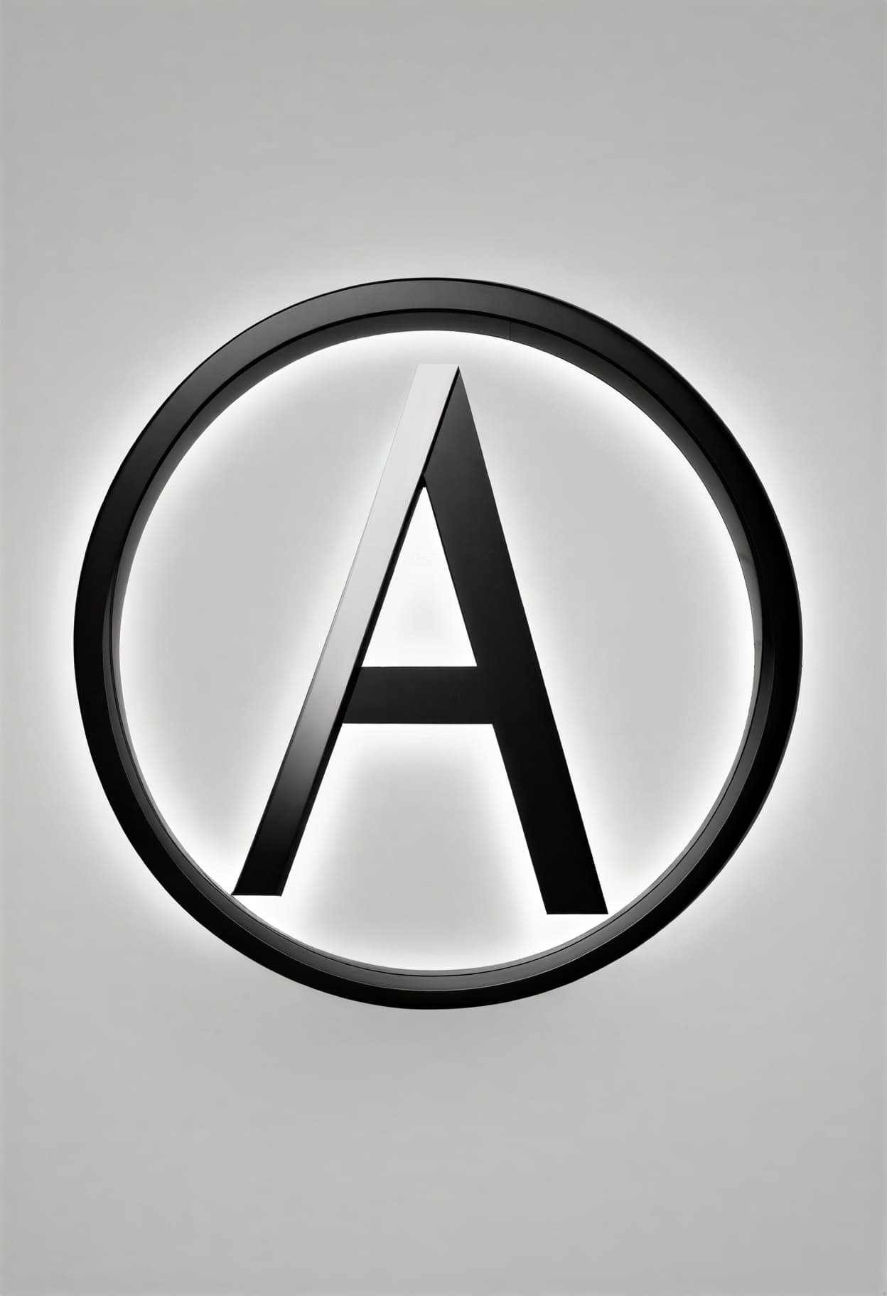
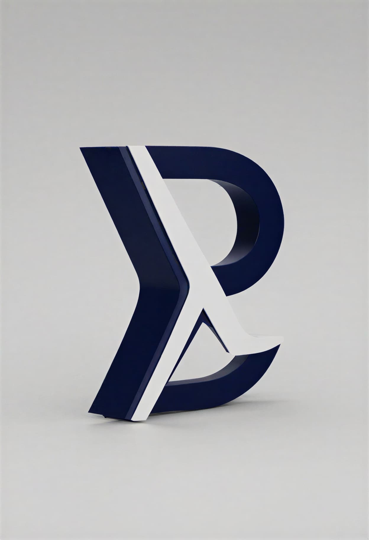
Wordmark Concept
The brand name itself is the visual identity.
logo design, wordmark logo concept, custom typography showing the word ATLAS in modified sans-serif letterforms, the letter A has a unique geometric peak replacing the standard crossbar, consistent stroke weight across all letters, letter spacing precisely balanced, deep navy blue (#0A1628) flat color, no decorative elements beyond the letterforms themselves, clean white background, horizontal composition, typographic precision, brand wordmark quality, high resolution
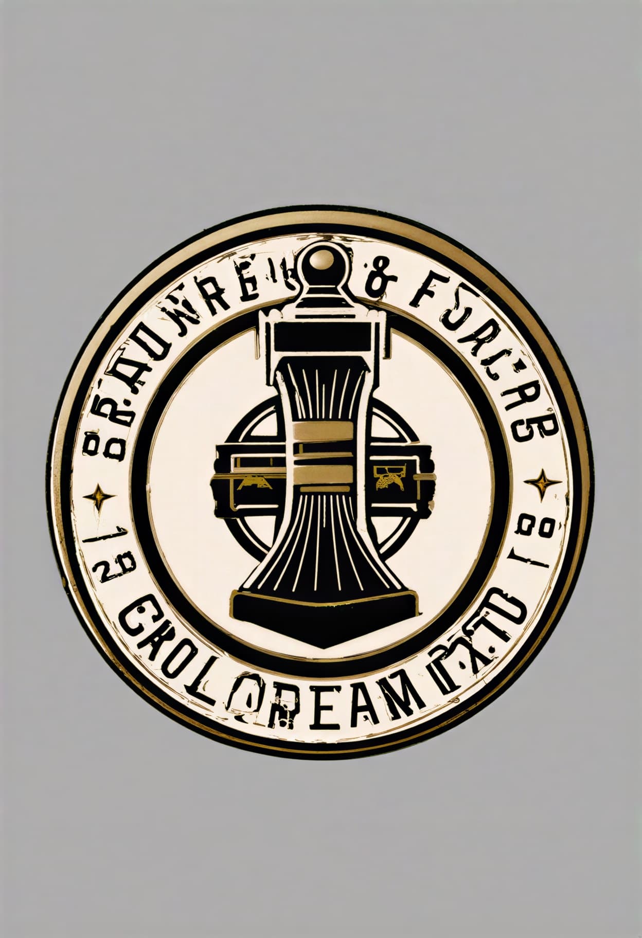
Vintage Circular Badge
Self-contained emblem with retro craft sensibility.
logo design, vintage badge emblem, circular border with thin double-line ring, brand name FORGE WORKS arcing across top inner edge, EST 2025 along bottom curve, centered anvil icon in simplified flat illustration, crossed hammers behind anvil, craft brewery and artisanal aesthetic, limited palette of dark brown cream and muted gold, slightly weathered but still clean-edged, nostalgic without being ornate, self-contained composition, badge and seal quality, high resolution
More AI Logo Styles
Six additional templates covering specific logo types and brand aesthetic directions.
logo design, lettermark monogram, flat vector, interlocking letters J and M forming a single unified geometric shape, letters sharing common strokes where they overlap, bold confident line weight, single color charcoal black on white, no additional icons or decorative elements, square composition optimized for app icon and social profile use, typographic precision with custom geometric letterforms, minimal and authoritative, high resolutionlogo design, hand-lettered style logo, organic brush script rendering of the word Bloom, natural variation in stroke weight suggesting real brush movement, flowing connected letterforms with expressive baseline variation, warm terracotta brown ink color on cream background, single accent leaf element extending from the final letter, artisanal and authentic feeling, no rigid geometric precision, suitable for boutique and lifestyle brands, hand-crafted brand quality, high resolutionlogo design, abstract geometric symbol, flat vector, three overlapping translucent circles arranged in a triangular formation, each circle a different tone of the same blue family creating darker overlap zones, no outlines, circles defined purely by color interaction, centered balanced composition with equal spacing, modern data and connectivity symbolism, clean technical aesthetic, transparent background, brand mark quality, high resolutionlogo design, retro badge logo, shield shape outer border with pointed bottom, banner ribbon crossing horizontally at center containing placeholder text area, mountain silhouette at top within shield, pine tree flanking each side, limited palette of forest green dark brown and off-white, flat illustration style with no gradients, outdoor adventure and national park aesthetic, vintage but legible, self-contained emblem composition, high resolutionlogo design, modern gradient logo mark, abstract flowing shape suggesting both a wave and a data stream, smooth gradient transition from deep purple (#4A00E0) at base to electric cyan (#00D4FF) at peak, single continuous form with no outlines, gradient as the defining visual feature, dark background (#0D0D1A) for gradient visibility, contemporary tech and AI brand aesthetic, Apple-level refinement, centered composition, brand mark quality, high resolutionlogo design, circular seal emblem, thick outer ring with brand name VERIFIED GOODS running along top arc and QUALITY ASSURED along bottom arc, centered checkmark icon in bold geometric style, small star separators between top and bottom text, two-color palette of navy blue and white, flat vector with uniform line weights, official and trustworthy, certification badge aesthetic, self-contained and scalable, high resolutionRecommendation: Negative Prompt for AI Logo Design
AI models are trained to produce visually rich, complex images. Logos require the opposite: precision, simplicity, and functional economy. The most common logo generation failure is not aesthetic ugliness but functional unsuitability — a beautiful image that cannot serve as a logo because it contains textures that don't reproduce in a single color, gradients that band when printed small, or detail that becomes noise below 100px. This negative prompt strips away the complexity that makes AI output unfit for use in brand identity.
Negative Prompt:
photorealistic, photograph, 3D render, realistic textures, wood grain, metal texture, fabric texture, paper texture, complex gradients, rainbow gradient, more than 4 colors, watercolor, oil painting, brush strokes, atmospheric effects, fog, smoke, lens flare, bokeh, depth of field, shadow, drop shadow, beveled edges, embossed, glossy, chrome, reflective surface, detailed background scene, landscape, person, face, animal photograph, too much detail, cluttered, busy composition, text that is not part of the logo design, watermark, signature, blurry, low quality
Explanation: The rendering block — "photorealistic, photograph, 3D render, realistic textures" — is the most critical. Logos exist as graphic marks, not photographs. Any photographic quality, realistic material textures, atmospheric depth, and camera-simulated bokeh make the output an image rather than a logo. "Complex gradients, rainbow gradient, more than 4 colors" enforce the color discipline that functional logos require. A logo that uses ten colors cannot be reproduced consistently across all media. "Watercolor, oil painting, brush strokes" prevent artistic rendering styles that look expressive but don't survive size reduction or single-color reproduction. "Shadow, drop shadow, beveled edges, embossed, glossy, chrome" block the dimensional effects that add visual weight but prevent the logo from functioning as a flat graphic, which is how logos appear on most digital and print surfaces. "Detailed background scene, landscape, person, face" prevent the model from generating a scene with a logo element embedded in it rather than an isolated mark on a clean background. "Too much detail, cluttered, busy composition" directly constrain the complexity level, pushing toward the simplicity that scalable marks require.
How to Generate Logo Concepts on Kalon Studio
- Open Kalon Studio and navigate to the Generate tab.
- Copy any prompt from this page using the copy button beside it.
- Paste it into the prompt field. Replace the placeholder brand elements — change "abstract leaf shape" to "stylized coffee cup silhouette," swap "forest green and white" for "burgundy and gold," and replace "ATLAS" with your brand name. Keep the rendering tags (flat vector, no gradients, clean edges) and the scalability constraint; these are the structural tags that produce functional logos rather than decorative images.
- Paste the negative prompt into the negative prompt field. For logos specifically, the negative prompt prevents photographic textures, complex gradients, and excessive detail — the three failures that make an AI-generated image look impressive but function poorly as a brand mark.
- Select your aspect ratio. Use 1:1 for icon marks, app icons, and social profile images. Use 3:1 or 4:1 for horizontal wordmark logos. Use 1:1 with generous padding for marks that need circular crop compatibility. Use 2:3 for vertical badge and emblem compositions.
- Click Generate. Review 4–6 outputs. Evaluate each at three scales: full resolution (does the mark look clean and intentional?), 128px (does it remain identifiable as a thumbnail?), and 32px (does it survive as a favicon?). The output that passes all three sizes is a functional logo concept. The one that only works at full size is an illustration.
Do/Don't Tips: Making Logos That Function
✅ DO:
❌ DON'T:
Kalon Vs Other AI Logo Design Tools
Kalon produces functional logo concepts with mark-type structure, scalability testing, and prompt engineering built for brand identity, compared to preset-only and platform-locked tools.
| Feature | Kalon Studio | Canva | Logo Diffusion | Adobe Express | QuillBot |
|---|---|---|---|---|---|
| Pre-written logo prompts | 11 tested templates | None, preset styles only | None, preset styles | Example prompts | Tips + examples |
| Copy-paste | One-click | Not available | Not available | Sample | Blog |
| Prompt library | Copy buttons | — | — | Prompts | Examples |
| Logo-type education | Mark type + rendering + color + scalability breakdown | None | 45+ style presets | "Be descriptive" tips | Tips guide |
| Logo-specific negative prompt | Anti-texture + anti-photo + anti-complexity | Not available | Not available | Not available | Not provided |
| Verified sample outputs | Kalon-generated at multiple scales | Style previews | Generated previews | Generated previews | Generated samples |
| Platform compatibility | Standard tags work anywhere | Canva-native | Platform-native | Adobe-native | QuillBot-native |
| Vector export | Flat vector-style prompt output | SVG via editor | Vector export included | Editor tools | PNG default |
| Mark type separation | Minimalist/Tech/Mascot/Wordmark/Badge/Lettermark/Hand-drawn/Abstract/Retro/Gradient/Seal | Style presets | Style presets | Style categories | Mixed examples |
| Free access | Daily coins included | 20 free/month | Free tier | Free with an account | Free tool |
Frequently Asked Questions
One Mark. Every Size. Every Surface!!
Flat vector rendering, color discipline, and scalability testing — prompts built for functional brand marks, not decorative images.
Generate Logo Concepts Free